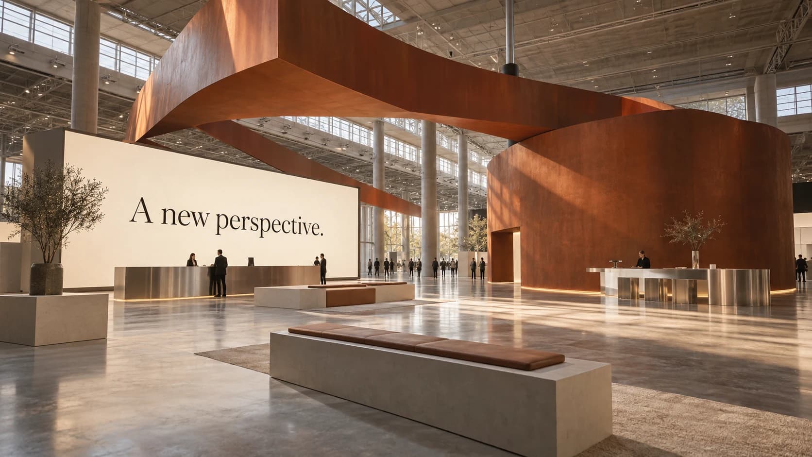
Start with the conversation, not the footprint.
An exhibition brief often begins with dimensions, screen counts, and a list of products. Those details matter, but they do not yet describe an experience. Before deciding what the space should contain, ask what a visitor should understand—and what kind of conversation the organization wants to have.
A technical audience looking for a detailed demonstration needs a different route through the space than an executive evaluating a strategic relationship. When those needs are made explicit, the booth can support both without asking every visitor to follow the same script. The footprint becomes a tool for the conversation, rather than the starting point for the brand.
Translate the brand. Do not simply enlarge it.
A visual identity designed for a screen does not automatically work in a hall. Viewing distance, lighting, material, and movement all change how a message is perceived. A dense layout that works in a brochure may become unreadable on a wall. A subtle color difference may disappear under exhibition lighting.
Translation requires decisions about what to preserve and what to adapt. The brand’s core relationships—its typographic character, use of space, image style, and tone—should remain recognizable. Their expression needs to change with the environment. That is the difference between placing a logo on a structure and designing a physical extension of a brand.
Give every layer of information a job.
Think about the experience at three distances. From across the hall, visitors need to recognize the organization and find a reason to approach. At the edge of the space, they need to understand what is happening and where to begin. Once engaged, they need the detail that supports a useful conversation.
This hierarchy should shape signage, screens, and printed materials. Repeating the same message at every scale creates noise. Assigning a purpose to each layer helps the environment feel clearer without necessarily reducing the amount of information available.
Design the beginning and the afterlife.
The conference experience begins in an invitation, an email, or a social post. It continues through registration, arrival, a presentation, and a follow-up. If those touchpoints are developed independently, the organization loses an opportunity to build recognition over time.
A shared creative framework does not require identical layouts everywhere. It establishes a recognizable visual language and a consistent central idea. Campaign assets can be expressive, wayfinding can be direct, and presentation slides can be information-rich while still belonging to the same experience.
Bring production into the creative conversation.
Material choices, screen specifications, fabrication tolerances, and installation schedules influence what is possible. Addressing them early gives the design team room to make intentional choices. Addressing them late often means making compromises under pressure.
A useful handoff includes clear artwork ownership, an agreed message hierarchy, a schedule for content approvals, and a process for reviewing production proofs. The aim is not to eliminate every change. It is to make sure the central idea survives the many decisions required to bring it into a physical environment.
For a marketing leader, the most useful question is simple: would someone recognize this as our organization if the logo were covered? If the answer depends entirely on the logo, the experience needs a stronger connection to the brand.
Thinking through a similar challenge?
Let’s talk about your organization